User interface design is a highly demanded science today, and for good reason.
With computing power and business ambition skyrocketing, the digital landscape is rife with too many features, and overly complex applications begging to be simplified by empathetic, thoughtful, and creative technologists.
Over the years, I’ve come to realize that the most beautiful user interface solution is not necessarily the one with the most likes on Dribbble, but the one that’s most user intuitive, provides the right amount of choice, and frankly knows when to get the heck out of the way.
Here is a list of tried and true concepts I’ve practiced in successful UI projects over the years.
1. Draw on the wall with a 3-up exercise
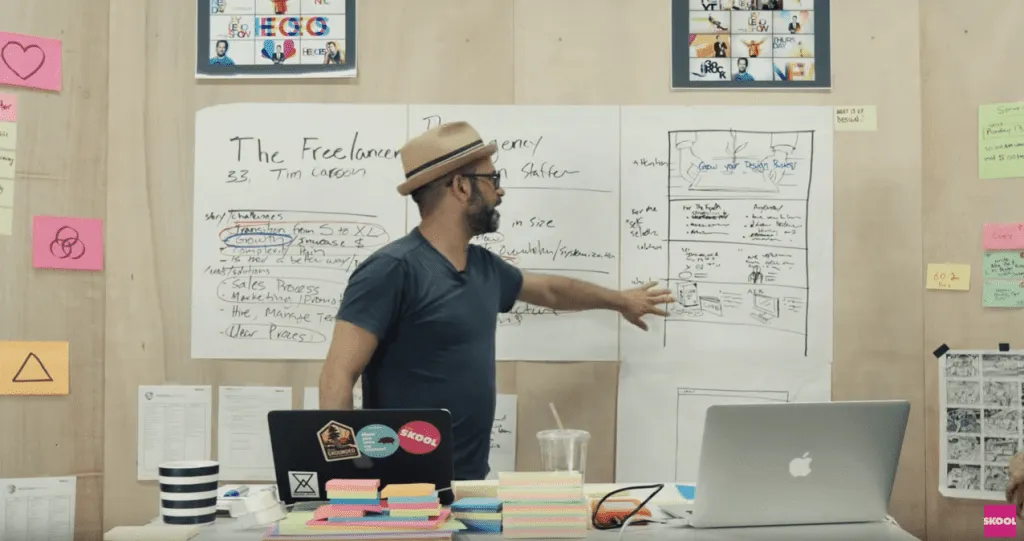
Here’s a great UX exercise to watch from the Skool Network video series titled, “What is UX Design?”. Watch the thought process involved in a real-life UX design kickoff for a one-pager sales website design.
The gist: Hang three large pieces of poster paper on the wall, side by side. Grab some colored sharpies and post-it notes. This exercise works best if your client is present.
Use poster #1 to list critical notes about your primary target user. Give your ‘user persona’ a name & age, and list out all their needs and challenges that you can think of. Next, brainstorm and discuss business methods and design concepts to meet those user’s particular needs. Circle tasks and messaging ideas you find most important. Try completing an empathy map to immerse into the behavioral and social perspective of your users.
On the second paper, repeat this process for another target user persona.
You’ll soon surface many of the most critical concepts, tasks and touch points to highlight in your design project.
On the third paper, start sketching a possible page template design informed by the most important user tasks you’ve decided to focus on. No need to create beauty at this point, but focus on the prioritization (stacking order) of content, messaging and basic UI needed to give the users you’ve just studied something meaningful and well-organized.
This design exercise also works for designing homepages, landing pages, and other critical screens and user flows. It’s a great method sketching designs with your user notes accessible in the same glance.
2. Don’t just record meetings, bring a note-taker.
Having a dedicated note-taker with you during design meetings allows you to truly listen, think clearly and facilitate effectively.
Your note taker can silently document all discussion points, takeaways, follow-ups, and dependencies that would otherwise tax your ability to stay focused.
Consider incorporating Brad Frost’s Project Hub for documenting your project notes and deliverables from start to finish.
3. Document your design thinking.
To improve your ability at articulating design micro-decisions, approach each project like a mini case study.
Throughout your design process, dedicate a few minutes after every mockup to capturing some simple notes on why and how you arrived at that final design (even if the design is subject to change based on forthcoming analytics).
4. Design on paper.
Using paper & pencil to sketch out UI ideas is fast, and offers a refreshing tactile experience for you quite different than your usual keyboard, mouse, or stylus.
This unconstrained method of visual thinking might open up new creative doorways to you and make your process feel less robotic too. Try collecting and analyzing a volume of paper sketches (even from non-designers around you) before jumping straight into your wireframe software. Be aware of more concepts and ideas before you rely on pure intuition and personal taste.
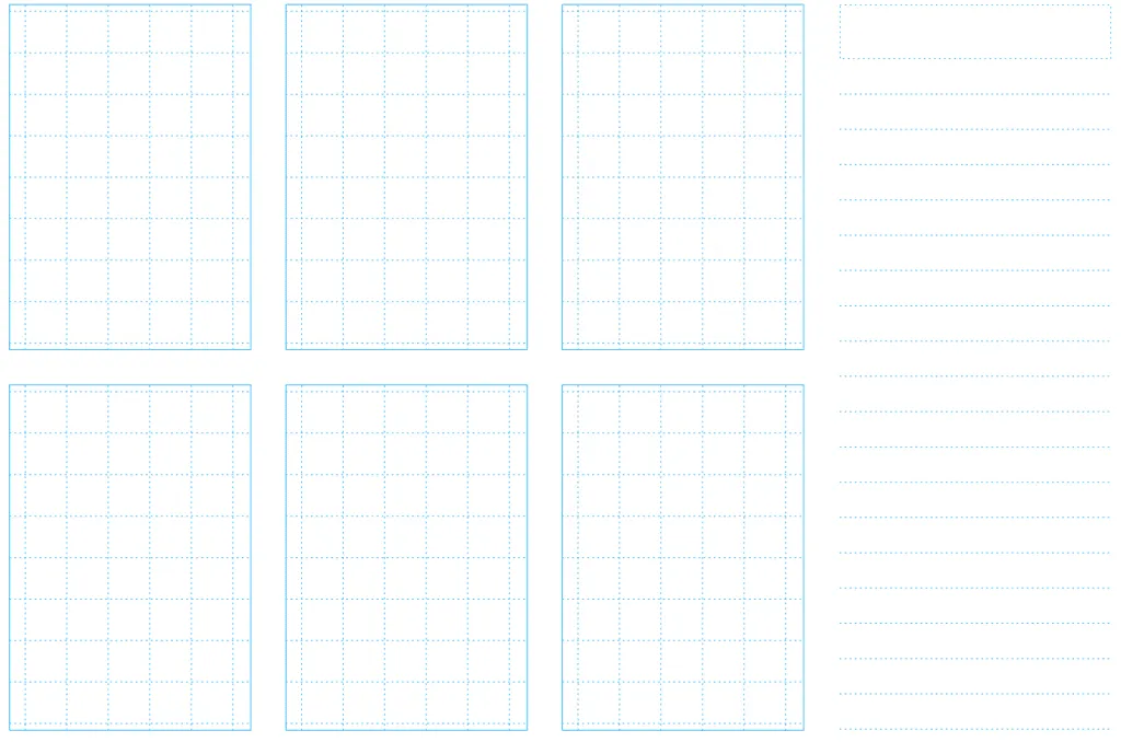
Photo credit: Box UK
Here’s a free printable paper sketch template to capture 6 ideas and supportive notes. Todd Zaki Warfel’s Prototyping book and the free Guide to Prototyping also offers great exercises for collecting UI ideas in bulk and narrowing down the strongest ideas.
5. Design mobile-first.
Designing on a mobile canvas size forces you to understand what you are designing–the content and it’s purpose, priority and messaging. There’s no room (literally) for getting lost in extravagant desktop layout ideas & complex hover effects that many of your users may not appreciate or see.

Programs like Sketch and UXPin allow you to quickly extend and sanity-check your mobile first layouts and design ideas on tablet and desktop canvases simultaneously. Ping-ponging between multiple canvas sizes will strengthen the responsive design ideas and tease out the edge case screen sizes that threaten your layout choices. Think deeply before you simply ‘hide’ a particular UI element on mobile because you can’t think of a quick way to display it within the allotted space.
6. Speak with visuals whenever possible.
Next time you’re explaining something complex during a screenshare, try drawing out your concepts in real-time using a tool like Sketchpad.
It doesn’t have to be beautiful, but a visual can keep everyone in your meeting engaged and less likely to misinterpret what you are talking about.
7. Try designing within a type scale.
Decide on a base font size for the long reads (somewhere between 14 and 20 pixels works best).
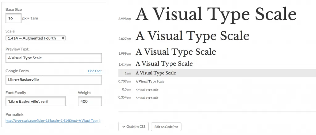
Photo credit: type-scale.com
Use this nifty typescale website to derive all the other font sizes you’ll support in your design project. Try keeping to this finite array of font sizes from large headline all the way down to body font consistent throughout your designs. This makes the global CSS stylesheet super scalable and never constrained by specific pixel values.
8. Honor your canvas size.
It’s a good idea to understand the maximum and minimum canvas dimensions you want to support with your design.
Maybe you want to support a large desktop display as well as a small smartphone in portrait orientation. Remember there is a maximum content width that you probably want your content (text, images, forms, etc) to stop expanding. Be wary of letting your copy blocks stretch wider than about 15 words across. Reading 16 words or more across is challenging and breaks the feel of smooth reading/scanning.
On small screen canvas sizes, don’t forget to add some left and right negative space or you’ll risk serious usability issues.
9. Go grayscale first.
Get your design to be super useful and intuitive in grayscale first. This forces you to focus on typographical hierarchy, size and negative space to to guide users’ eyes where they need to go.
Try adding in color last and watch your design come to life knowing even users with degrees of color-blindness (for which there may be many) will understand your interface design effectively without relying on color cues. It’s also important not to get lost in the often emotional power of color too early in your UI design process.
If you’ve never tried this, I highly recommend experimenting with this process.
10. Don’t wait for feedback.
Share your designs and gather feedback and validation as early as possible. Don’t wait until your designs are pixel perfect before you ask another person if they understand what the design is trying to accomplish.
I’m a big fan of UXPin’s Sketch/Photoshop Plugin because it allows the designer to import a whole component library of design assets and quickly generate screen designs and prototypes just by dragging around and repositioning components.
Always test a variety of layouts and ideas before committing to one.

