
Frames
Frames act as containers for your prototypes, helping you group, organize, and manage different design elements within a defined space.
In UXPin, Frames allow you to build highly responsive prototypes with coded (Merge) components. This means you can easily see how your design will look and work on different devices and screen sizes, by quickly switching between Frame sizes. Thanks to that, you can make sure it looks great whether it's viewed on a smartphone, tablet, or desktop. Frames help you test and improve your prototypes for different scenarios without having to create separate versions for each device. At the same time, for designs built with native (non-code-backed) components, with Frames, you can create canvases or artboards that are heavily used in competitive design tools.
Creating Frames
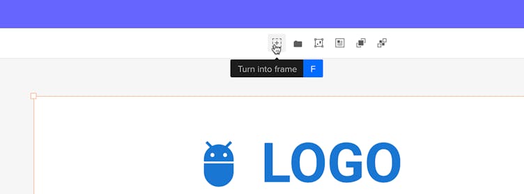
You can create a frame around existing objects, whether it's a single layer or a selection of layers. To do this, use the Frame selection keyboard shortcut:
"F"
, or turn your selection into a Frame from the Top bar or Context menu.
There are a few ways to create Frames with different sizes on the canvas:
- From Quick Tools Bar: Select the Frame tool from the Quick Tools Bar or press the
"F"
key. Click anywhere on the canvas to create a default frame (300 x 100 px), or click and drag on the canvas to create a frame with custom dimensions. - From Selection: Turn a selection of layers into a Frame that matches the size of the selection.
- Drag to Resize: Click and drag the corners of the Frame to set custom dimensions.
- Use Presets: Select a Frame preset from the dropdown in the right sidebar to choose sizes for popular devices.
- Set Exact Size: Enter specific width (W) and height (H) values in the right panel to set a precise size for your Frame.
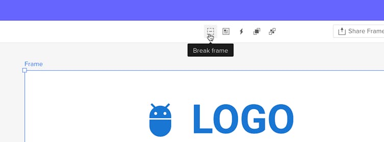
To remove a Frame, select it and choose option Break in the Top Bar or press
Ctrl
"Shift"
"F"
to ungroup it.
Note
Nested frames are not supported at this time, you cannot place one frame inside another.
To add elements to a frame:
- Drag elements from the library.
- Use the drawing tools directly over the frame.
- Drag a component from the canvas or another frame.
Frame properties
Frames have several properties you can adjust:
- Name: You can rename a Frame from either the Layers panel or the Top bar. Once updated, the Frame’s name will be reflected everywhere it appears: in the Layers panel, Top bar, and on the canvas.
- Size: Change the Frame’s width and height. You can use predefined presets, enter custom dimensions in the W and H fields, or hover over the icons to adjust the size by dragging left or right. Use the link button to lock the width and height together so they resize proportionally.
Tip
You can use the dimension fields for calculations to quickly scale or resize.
- Scrolling: Add vertical or horizontal scrolling to view elements inside the Frame that are outside the visible area. Choose horizontal scrolling to see elements to the right or vertical scrolling to see elements below the Frame.
- Fill: Add a solid color, gradient, or image to the Frame.
- Border: Add a stroke to the Frame.
- Shadows: Apply outer or inner shadows to the Frame. Note that outer shadows are not visible in the Frame Preview Mode.
- Blur: Apply a blur effect to the entire Frame or its background.
Frame Interactions
In addition to the interactions you might already know from Elements and Canvas triggers (listed here), there are some specific interactions for Frames:
Frame Triggers
- Scroll: Triggers when the Frame Preview is scrolled to a specified height.
- Frame Load: Triggers when the Frame is fully loaded.
- Frame Resize: Triggers when the Frame’s window preview is resized, either manually or by changing the Frame preset in the Top bar.
Frame Actions
- Go to Frame: Use this action to link to other Frames within your canvas.
Frames & Native Elements
In UXPin, Frames can be used with native elements just like artboards. They help you isolate and manage specific sections of your design, making your workspace more organized and focused.
If you want to make your prototypes with native components responsive across different screen sizes, use interactions like Frame Resize along with Conditional Logic and Go to Frame action. This setup helps you see how your designs adjust to various screen sizes.
Quick Setup Guide:
1. Create Your Frames: Add Frames for different device sizes, such as mobile and desktop.
2. Add Frame Resize Trigger:
° Select the Frame you want to make responsive.
° Add an interaction: Frame Resize. This will allow the Frame to respond to changes in size.
3. Set Up Conditional Logic:
Define conditions to handle different sizes:
° Go to Conditions and set expressions based on
"Iframewidth"
or
"Iframeheight"
.
° For Desktop Frame: If
"Iframewidth"
is less than 500.
° For Mobile Frame: If
"Iframewidth"
is greater than 500.
4. Configure Go to Frame Action:
Based on your conditions, set up actions:
° For Desktop to Mobile:
When the condition (e.g.,
"Iframewidth"
< 500) is met, add the action Go to Frame → Select your Mobile Frame.
° For Mobile to Desktop:
Copy the interaction from the Desktop Frame (
Ctrl
"Shift"
"C"
), paste it into the Mobile Frame (
Ctrl
"Shift"
"V"
), and update the condition to
"Iframewidth"
> 500 → Go to Frame → Select the Desktop Frame.
5. Optional: Use Set State for Layouts:
° If your Frames have groups with states for different layouts, use Set State instead of Go to Frame to switch between states (e.g., Mobile or Desktop views).
6. Preview and Switch between Frame Sizes: Once all interactions are set up, go to Frame Preview and change the Frame Size by selecting one of the predefined Frame presets in the Top Bar.
This adds a layer of interactivity, allowing you to see how elements will respond to user actions or screen size changes directly within the frame.
Note
Conditional Logic and Advanced Interactions are available only on Advanced, Merge AI, Company, and Enterprise plans
Frames & Merge Components
When using Merge Components, Frames provide greater flexibility. They help you test and adjust your components to ensure your prototype works well across different screen sizes.
Think of Frames as iFrames within your design, providing several key benefits:
- Preview Component Behavior: By placing Merge Components inside a Frame, you can see how they respond and adjust as the Frame’s size changes. This allows you to visualize transitions and interactions in real-world scenarios, helping to identify and resolve potential issues.
- Support for Media Queries: Just like iFrames, Frames support dynamic resizing and styling through media queries, including those from design systems pushed to UXPin via merge-cli. This means you can observe how components automatically adjust their appearance and behavior to fit different screen sizes, ensuring a responsive design.
- Isolate Components from the UXPin Interface: Merge Components placed in Frames are isolated from the UXPin UI. This prevents components with overlay properties from interfering with the interface. For example, if a Menu component has its 'open' attribute set to true, it could otherwise open a dialog that covers the interface and cause the prototype to freeze. Using Frames prevents such issues, ensuring a smoother workflow.
Tip
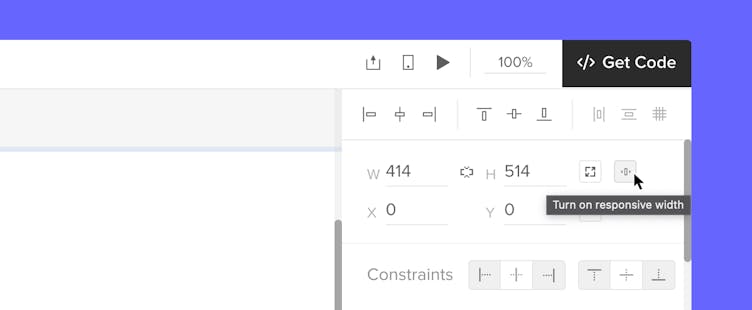
Enable Responsive Width for your main container to ensure your components automatically adjust to 100% of the frame width.
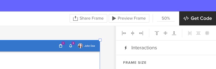
Preview and Share Frames
Previewing Frames in UXPin allows you to see your designs in action, giving you a clear view of how they behave across different devices. You can preview individual Frames or the entire canvas, and share previews with others.
Previewing Frames
Preview a Selected Frame: To focus on a specific Frame, select it and press
Ctrl
"I"
or click the Preview Frame button in the top bar to open the Preview mode. This lets you:
- View the Frame’s design, helping you catch any issues or improvements needed before finalizing a design.
- Easily switch between different device presets from the Top bar.
- For designs using Merge Components, previewing helps you check how these components adapt to different screen sizes, ensuring they perform as expected.
- Interact with your design elements directly in the preview, allowing you to experience user interactions and transitions in real time.
- View specs and see the code of all components in the Frame.
Custom Frame Size in Preview
Setting custom frame dimensions directly in Preview allows you to test and adjust your designs quickly in real-world scenarios. Use the Custom Size option in the breakpoint dropdown to define specific width and height values and see how your designs respond to different setups.
Here are a few ways you can set and fine-tune your frame dimensions:
- Choose a Predefined Preset
Use Arrow +Ctrl
to select from predefined breakpoints for common screen sizes. - Enter Custom Dimensions
Type the width and height values you want into the fields. - Reset to Auto Size
Clear the fields to set the frame dimensions to auto. - Adjust with Arrow Keys
Use the arrow keys to make the size bigger or smaller by 1 unit at a time. - Save Your Custom Size
Press"Enter"
to save the size you’ve entered.
Preview the Entire Canvas: To view multiple Frames together, unselect a frame element and use the Preview ▶️ option from the top menu. This shows the entire canvas with all Frames as design elements.
Note
Frames do not support comments. To add comments, you will need to do so outside of the Frame.
Sharing Frames
To share a preview of just the selected Frame, press
Ctrl
"Shift"
"P"
or click the Share Frame button in the top bar. This opens the Share modal, where you can:
- Copy the URL or QR code to share with others.
- Share by email directly from the modal.
To use Frames effectively, consider what you need for your design:
- For responsive design work, use Merge Components and frames to see how your components will adjust to different layouts and devices.
- When working with native elements and you want a more structured canvas, treat frames like artboards to isolate different parts of your design.