Elements
The Quick tools menu to the left of the Interface contains a number of elements and shapes you can add to your design. Select any of them and click-and-drag on the canvas to draw it or simply click to drop it.
Box
Select the Box from the top of the Quick tools panel or use the
"B"
shortcut. It will have handles in each corner. You can use them to resize the box as well as double click to insert text inside the box.
There’s a difference between the Box and the Rectangle. You can add and edit the text inside a Box, whereas the Rectangle is a vector shape that you can customize by dragging its vector points or adding new ones. Also, you can't define separate borders or the padding for the Rectangle.
Elastic Boxes
By default, the text inside the box is set to Fixed size, but you can make a Box expand as you type into it and automatically adjust to fit the text that's inside. To do that, just uncheck the Fixed Width and Height option. The same works for Buttons.
Shapes
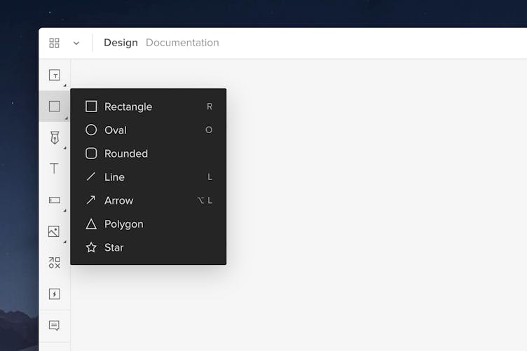
These are the most commonly used shapes and shortcuts for some of them. Once you add them, you can double click on the shapes to enter the vector edit mode. This allows you to add additional points or manipulate the existing ones separately.
- Rectangle -
"R"
- Oval -
"O"
- Rounded
- Line -
"L"
- Arrow -
Alt
"L"
- Polygon
- Star
Tip
Hold down Shift while dragging to create perfect shapes and elements.

Polygon
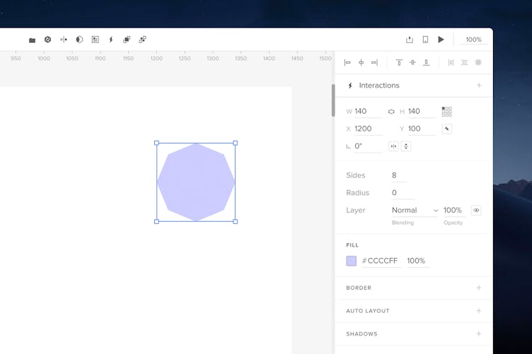
Once you create the Polygon, you can add more points to it in the Properties panel as well as manipulate each point individually. After you manipulate it, it becomes a regular shape and you can no longer edit its sides.

Drawing Tools
You can draw your own vector shapes using the Pen and Pencil tools. To use the Pen Tool, click the Pen icon or press
"P"
. Then, click on the canvas to add your first vector point and click and drag to add a curved point.
The Pencil tool allows you to draw shapes completely freehand. Click the down arrow under the Pen icon, choose Pencil and simply start drawing. Read more about our drawing tool in this tutorial.
Text
To add a text box, click the Text icon from the Toolbar or use the
"T"
shortcut. Click on the canvas to add it or click-and-drag to create a text box of a fixed size. You can start typing right away. Read more about styling text here.
Forms
Forms contain all the most common form elements:
Button
To add a button, use the
Alt
"B"
shortcut or add it directly from the Forms menu. You can edit the text inside the button as you want. By default, it is set to a fixed size. If you uncheck the Fixed Width and Height option in the properties panel, the button will adjust to the size and volume of text you enter into the element.
Input and Textarea
Inputs and text areas allow users to type responses in forms. Use inputs in forms for short, single-line responses such as passwords, emails, phone numbers, or dates. Text areas are the best for long multi-line responses like feedback forms. At the bottom of the Properties panel, you can change the Input's type, add a placeholder text or turn it into a disabled input. You can also add a placeholder for the Textarea.
Select List and Multiselect
You can use the Select element to create a Select List. The Multi-select is a drop-down list that allows multiple selections on Preview by holding down
Ctrl
when clicking.
Checkbox
Checkboxes can be used in forms where users are supposed to make single choices such as subscribing to a newsletter or multiple choices such as choosing toppings on a pizza in an order form. By default, a checkbox begins as unchecked. To have it displayed as checked, check the Checked option in the Properties panel in the Checkbox section.
Radio button
A radio button is a form control that lets users choose one option out of several. For instance, after they enter their phone number in a form, they can indicate whether it's their home, work, or mobile phone.
Images
In Media, you have three types of elements: Images, Video, and Audio.
Adding Images
You can add an image via:
- The Quick Tools menu
- The
"I"
shortcut - Drag-and-drop
- Copy-paste
When selecting images from your computer, you can choose more than one image. The cursor will then appear as a plus icon allowing you to choose exactly where you want to place each image. Click anywhere on the canvas to add an image with its original size or click-and-drag to define the size. If you selected more images, you will also see how many images you have left to place on the canvas.
Note
Images larger than 4000px in either height or width will be optimized.
Add images to elements
UXPin allows you to place images within the existing elements. Select the images you want to add from your computer and click on an existing element on your canvas. This will apply the image to that object as a Fill with the Fill mode set to Fit to fill.
Editing images
You can change the image resize behavior in the Properties panel. The default behavior is Fit to fill, but you can change it to Stretch, Contain, or Don't resize. That's also where you can crop images or make Adjustments in its Brightness, Contrast, Saturation, and more. To bring a resized image back to its original size, click Original Size.
Video and Sound
With the Video and Audio element you can link videos and sounds to your prototypes and control them with interactions like Play, Stop, and Pause.
- Open Media... in Quick tools and choose Video or Audio.
- Paste the link to the file in the Properties panel.
- Specify whether you want your video or sound to autoplay, loop, be muted or if you want to show the video’s default controls.
Click Preview to see your video or hear your sound.
Note
Autoplay is muted by default.
You can define the way videos fit the container box and set it to: Stretch, Fit to fill, Contain, and Don’t resize.
You can use links to files that are hosted on a server in the following formats:
- Videos:
MP4,WebM, andOgg - Audio:
MP3,MP4,OggandWAV
Links to videos that are on YouTube or Vimeo don’t have the Fit option available and can't be controlled with interactions.
Note
Safari and UXPin Mirror support only MP4 video files and MP3 audio files. There are also issues playing video files from Dropbox.
Icons
To add an Icon, select the Icon image or use
Alt
"I"
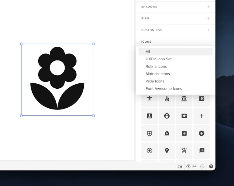
and click on the canvas or click-and-drag to draw it. The default icon is the cog icon. In the Properties panel in the Icons pane, you can browse through several icon libraries.

Importing and Editing Icons
If you are importing an SVG icon, just drag-and-drop it directly into the canvas. When you look at the Layers Panel, you will see that your icon is a group of pen tool paths.
Resizing Icons
You can resize your vector icon by holding down the
"Shift"
and dragging one of its corners. If you need pixel precision, adjust the size in the Properties Panel on the right.
Recoloring Icons
Once you import the icon in SVG format, click on the layer you want to recolor in the Layers panel and go to the Properties Panel. In the Fill section, you can set the color values.
Exporting Vector Elements
You can export pen tool elements, combined shapes, groups of pen tool elements or shapes, mask groups, icons, and even the background image of HTML elements.
- Click on the element from the canvas.
- Bring up the context menu with a right-click.
- Select Export and the format - PNG or SVG - from the menu.
Tip
For a speedy export, use the shortcut "cmd" "E" to trigger your previously selected export settings.
Hotspot
With hotspots you can add an interaction on top of any element. To add it onto the canvas, either click the hotspot icon in Quick tools or use the
"H"
shortcut. Then, click to drop it ot click-and-drag to draw it.
Hotspots are especially useful when you want to make only parts of layers clickable. This way you don't have to add interactions to specific elements. Hotspots are transparent boxes which you can place anywhere on your design and add interactions to. One of the most frequent usages of hotspots is linking to another screen of your design, to external URLs or triggering animations. You can toggle the visibility of all your hotspots in the View Settings.
Design System Libraries
In Design System Libraries there are built-in libraries, such as iOS, Material Design, User Flows, Foundation, and Bootstrap with ready-to-use interactive elements, colors, text styles, and icons. You can read more about them here.
 Getting Started
 Editor
 Sharing
 Dashboard
 Design Systems
 Merge
Merge Account
 How-to
 Tips and Tricks