
Color Design Tokens
Color Tokens are currently in open beta.
Note
Libraries created before July 17, 2024, must be converted to token libraries to use color tokens. This conversion is done in the Library Settings and is irreversible.
What are design tokens?
Design tokens are variables that define design properties like colors, typography, and spacing within a design system. They represent visual design decisions, allowing for centralized management and updates across the entire system rather than hardcoding specific values directly into components.
A key challenge in cross-platform development is the varying style properties and formats used by different operating systems. Instead of using static properties, designers and engineers reference tokens like
"Uxpin.cta.primary"
for instance, which represent all necessary color codes (e.g. HEX, RGB, RGBA, Octal). This ensures consistent colors across platforms and programming languages.
Benefits of Design Tokens
- Single Source of Truth: Centralized repository for maintaining design and code consistency, ensuring all designers use the same styles and properties.
- Simplified Management: UI elements become easier to implement, manage, and update across various platforms and environments.
- Improved Collaboration: Allow for common language between designers and developers, enhancing communication and teamwork.
- Scalability: Make scalable design changes across multiple products and platforms without redundant effort.
- Flexibility: Quickly adapt to new design trends or brand updates by modifying tokens instead of individual components.
Using Color Tokens
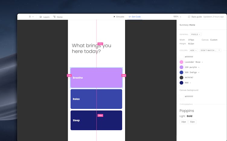
Color Tokens are an integral part of the Design System Libraries and you can access them from the colors section of your library.
To create a new library or access an existing one:
- Go to Design System Libraries or press
Ctrl
"2"
to open it. - At the bottom of the panel, click + New library.
- Once your library is created, navigate to the colors section.
Adding Color Tokens
You can add color tokens to the library in two ways:
- From selected elements – select one or more elements on the canvas and click +Add in the library panel to add all colors.
- With a HEX code – type in the HEX codes to add colors automatically.
The colors from your selected library will also appear in the Color Picker. Apply them to elements by selecting the element and choosing a color from the library. This allows you to set properties like fill, border, and shadow colors.
Organizing Color Tokens
Each color token has a unique ID, allowing you to add as many colors as needed. To maintain order and organization within your token library, follow these best practices:
- Avoid Duplicated Colors. Ensure each color in the library is unique to keep things clear and efficient.
- Use Descriptive Names. Name your tokens in a way that shows their use; for example,
"Background-primary-button"
or"Header-text-color"
. This makes it easy to understand each token's purpose at a glance. - Group Similar Tokens. Organize tokens into logical groups, such as by function (buttons, text, backgrounds.) Use prefixes or categories in the library to keep them sorted.
- Usage Guidelines. Provide documentation within your Design System that explains how and when to use each token. This helps ensure everyone on your team uses them consistently.
- Regular Maintenance. Regularly review and clean up the token library. Remove any out-of-date tokens and make sure the naming conventions and categories are still relevant.
- Consistency Across Platforms. Ensure that color tokens are defined the same way across all platforms and devices to maintain a uniform appearance.
Managing Color Tokens
You can manage your color tokens in a few ways:
- Edit: Modify the color values of existing tokens directly in the library or Design System.
- Add: Create new color tokens for your library.
- Remove: Delete color tokens that are no longer needed. This will disconnect color tokens from all elements that used them.
- Detach: Separate tokens from elements in the properties panel to use regular colors not connected to a library.
- Rename: Change the names of tokens for better organization and clarity.
Updating Color Tokens
You have control over when and how prototypes update with changed colors. Changes in other prototypes need to be manually triggered by the user, ensuring that updates are intentional and controlled.
When you modify elements using these tokens in your prototype, a Token Update modal will appear. This modal provides a clear Before/After state, including a color swatch HEX value, to show any changes made, including the name of the color. You will also have two options:
- Cancel: If you do not want to apply the changes, you can cancel the action.
- Update: If you choose to update, the tokens in the library will be updated. These changes will then reflect across all elements in your prototype.
Updates across projects
If other prototypes contain elements with the old token, a badge will appear next to the Design System Library icon. Click on the badge to bring up the Token Update modal, review the changes, and click Update.
Library Components using the old token will also update to reflect the new value in the library component preview.
Detaching Colors
To disconnect a specific element or component from a color token, you can detach it. Follow these steps:
- Select the element on the canvas.
- Click the
"Detach token"
icon next to the token name under the Fill property in the right panel.
This action will disconnect the color token from the library, showing the regular HEX value of the color instead. This allows you to test new styling for your tokens without having the color's value overridden.
Detaching tokens provides greater flexibility when modifying specific parts of your design without impacting the entire system.
Using Color Tokens with Merge Components
Color tokens are integrated with merge color properties that utilize
"@uxpincontroltype color"
. This attribute provides a color picker, allowing you to select and apply tokens directly to your merge components, just like with native elements.
Deleting Color Tokens
To delete a color token from a library, enable the edit mode, select a color, and click Delete
To delete the whole library, click the cog icon at the bottom, choose Library settings and then Delete library. Removing a library with a corresponding Design System will remove the system too.
When color tokens and libraries are deleted, colors are detached from the tokens. All components on the canvas, libraries, and Merge Patterns will retain the color value but will be shown as detached from the color token.
Color Tokens in Get Code Mode
In Get Code Mode, you can see a detailed overview of all tokens used in your prototype. Each token will display its name and provide an option to copy its HEX value.
Note
The Style Guide will only show the original names of the colors along with their hex values, without any link to the token values.