What is Design Simplicity and How to Achieve it?
Design simplicity is a term companies use without truly understanding its meaning. As discussed in this article, simpler isn’t always better, and how designers apply simplicity can have positive and negative effects.
This article defines what UX design simplicity is (and isn’t), some common misconceptions, and strategies for implementing its principles.
Simplify your product design and development process with UXPin Merge–technology that allows you to design prototypes using production-ready components, and thus bridging the gap between design and engineering. Visit our Merge page to learn more about this revolutionary technology and how it can enhance simplicity in design.

What is Design Simplicity?
Design simplicity refers to the UX principle of helping users achieve goals efficiently using intuitive UIs and minimal roadblocks. To achieve this, designers must understand user needs, their end goals, and the tools and features they need to complete tasks.
Simplicity isn’t always the best option. The users, product, context, and environment all play a critical role in balancing design simplicity with usability.
Simplicity in Design Does NOT Mean…
Simplicity in design is probably better defined by what it is not. The word simplicity is somewhat subjective, and therefore, open to misinterpretation. Here are three common misconceptions about design simplicity.
1. Simplicity is not minimalist
When people hear design simplicity, they often think it refers to minimalism–this is an incorrect assumption. Minimal design creates beautiful aesthetics, but that doesn’t mean it’s practical or helpful.
There is always a time and place for minimalism, but designers must present the appropriate tools and UI elements for users to complete tasks efficiently.
For example, this Shopify Theme creates minimalism by hiding the primary navigation behind a hamburger for desktop users. This design looks great, but shoppers must click twice to navigate.
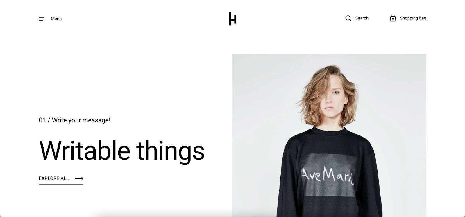
Creating additional steps in the name of minimalism does not conform to the principles of design simplicity. Designers must be mindful of how minimalism impacts the user experience and find an appropriate balance.
2. Design simplicity is not about aesthetics
Design simplicity is not about aesthetics. While it’s crucial to create beautiful UIs, it must not be at the expense of user experience. Aesthetics include static images, video, UI components, styling, and microinteractions.
Designers must always consider the value of design decisions and whether making something look aesthetically pleasing impairs usability. For example, using elaborate, drawn-out animations might seem like an excellent way to impress users, but it slows progression resulting in a poor user experience.
3. Simplicity is not simplification
This heading might seem contradictory, but it’s another common misconception about design simplicity. Oversimplifying a product or feature can create negative consequences or dull the user experience.
For example, eliminating user verification to simplify onboarding results in bots, spammers, and other criminal elements accessing the product that harm the company and its users. Simplifying this onboard process means:
- Making sure the system sends users a verification email immediately
- The email has minimal text and a clear CTA to complete the verification process
- The user can log in and begin using the product
Check how to create a secure user experience in our article Designing for Security.
Designers must also consider when to simplify. For example, simplifying a game, so users always win doesn’t present enough of a challenge, and players will lose interest. The simplification in this scenario lies in the game’s controls–giving players the appropriate tools and features to complete difficult tasks.
How to Apply Good Design Simplicity
With a clear understanding of design simplicity’s misconceptions, it’s time to look at some guiding principles and strategies and how to apply them.
1. Designing only what’s essential
One of the essential ingredients to design simplicity is only providing the UI elements and features users need to complete a task. Executing this simplicity effectively means designers must have clear objectives while understanding users, their circumstances, and the environment where they’ll use the product.
Delivering what’s essential might seem obvious, but too much reduction leads to minimalism–which we’ve already established we want to avoid. Designers must consider multiple scenarios rather than getting users to a single end goal.
For example, when designing an eCommerce checkout, it’s tempting only to push shoppers in one direction–complete the purchase! What about shoppers who change their minds and want to go back or save their cart for a later date?
The essential elements in this scenario are controls to complete checkout efficiently while providing offramps for shoppers who change their minds.
Complex products and UIs require more thought, UX research, and testing. Designers must reduce and prioritize content as much as possible to avoid cognitive overload, guiding users to complete tasks efficiently.
Coherency, consistency, and familiarity
Coherency, consistency, and familiarity are essential design simplicity components. Maintaining these three factors throughout a product requires attention to detail and effective cross-functional collaboration.
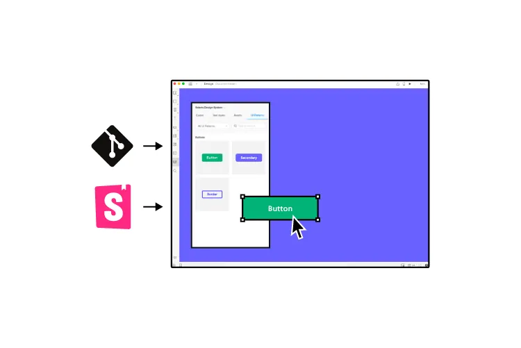
A design system is the most effective method to achieve coherency, consistency, and familiarity in product development. Organizations can build a design system from scratch or use an open-source component library to ensure designers and engineers deliver high-quality outputs with minimal errors.
PayPal uses Microsoft’s Fluent UI design system with UXPin Merge for the company’s sixty-plus internal products. When Erica Rider, Senior Manager for UX – Developer tools and platform experience at PayPal, joined the company, PayPal’s products lacked cohesion and consistency, resulting in countless usability issues.
By adopting a design system and using Merge to sync design and development, Erica created a single source of truth that enables PayPal’s product team to deliver projects 8X faster than before with significantly higher quality.
“Rather than separating design, prototyping, and development, UXPin Merge allows us to create an integrated flow where we engage engineering and product teams throughout the process. As a result, the product’s final quality has improved dramatically”–Erica Rider, PayPal
Offering the easiest solution
Design simplicity requires designers to think of the easiest path to completing a task. Ideally, designers want to reduce friction and obstacles to minimize cognitive load–there are exceptions to this rule, which we describe in this article about good and bad cognitive friction.
Designing an easy-to-use UI includes removing distractions and minimizing options. For example, designers often hide header and foot navigation for eCommerce checkouts and landing pages, so users only have one task to focus their attention.
Test, test, and test again
Testing is the best way to understand users and whether a design solution works. Seeing users struggle with a task and identifying the cause allows designers to fix the issue and simplify the process.
Testing is also an ideal space to see how users use a product and identify redundant features. Removing features and elements people don’t use helps minimize UIs and distractions.
Conduct routine UX audits
Routine UX audits are excellent for identifying usability issues that adversely impact simplicity. User testing and research during the design process often don’t tell the whole story. Designers must review analytics and monitoring tools to understand how users navigate the product and its features.
Designers can use UX audit insights to prioritize content, visual hierarchy, navigation, add/remove features, restructure layouts, and improve information architecture to simplify the user experience.
The progressive disclosure approach
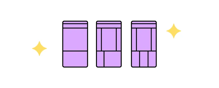
Progressive disclosure is an interaction design technique for complex tasks and user flows. The idea is to break tasks into digestible steps to simplify a complicated process.
We commonly encounter progressive disclosure when a company has to capture lots of user data–insurance, visas, medical services, etc. Instead of presenting everything on one screen, designers split the form into multiple steps and categories. This user interface design technique makes forms less intimidating, allowing users to focus on one step at a time.
Learn more: What is Progressive Disclosure?
John Maeda’s 10 Laws of Simplicity
Graphic designer, visual artist, and computer scientist, John Maeda is arguably the godfather of simplicity. John’s 2006 book, “The Laws of Simplicity,” outlines 10 principles for design, technology, business, and life.
- Reduce: remove what isn’t needed
- Organize: makes complex systems easier
- Time: saving time feels like simplicity
- Learn: knowledge makes things simple
- Differences: balancing simplicity and complexity
- Context: “What lies in the periphery of simplicity is not peripheral”
- Emotion: more emotion is better than less
- Trust: simplicity = trust
- Failure: some things aren’t meant to be simple
- The one: subtract the obvious and add the meaningful
Simple UX Design With UXPin Merge
Simple design applies to the UX process as well as user experience. Bridging the gap between design and development enhances collaboration and streamlines handoffs while reducing errors and front-end debt.
UXPin Merge is an end-to-end product design solution that creates a single source of truth between designers and engineers. Merge allows organizations to sync a component library from a repository to UXPin’s design editor so everyone uses the same design system.
These ready-made, interactive components simplify workflows by giving designers the building blocks to create fully functioning prototypes that look and feel like the final product. With no designing from scratch, designers can focus on product development rather than component development.
Merge simplifies the design handoff process because engineers work with the same component library. Devs simply import the components from the design system’s repository and apply the JSX changes from UXPin to start front-end development. Less documentation. Less communictation between departments. Faster time to market!
Simplify your product development process with UXPin Merge. Visit our Merge page for more details and how to request access.