User-Friendly — What Does it Mean and How to Apply it?

User-friendly design is a fundamental aspect of UI and UX design, driven by a desire to make technology more accessible and usable for everyone.
Over the years, designers have developed methodologies, best practices, and design principles to create interfaces that prioritize user needs and enhance usability. As technology continues to evolve, user-friendly design remains a critical consideration in creating successful digital experiences.
How to tell that your interface is user-friendly? You need to test it! You can’t test a static prototype. That’s where UXPin comes in. It’s an easy-to-use tool for functional prototyping that increase the quality and impact of user testing. See how fast it is to build interfaces with UXPin. Try UXPin for free.
What is the definition of user-friendly?
User-friendly is a term that describes products, interfaces, or systems designed with the user’s ease of use and convenience in mind. It signifies that the item in question is intuitive, easy to understand, and navigate, enabling users to accomplish tasks with minimal effort and frustration.
In an English dictionary, “user-friendly” is typically defined as an adjective that describes something (such as a product, system, or interface) that is easy to use or understand, especially for the end user. It suggests that the item or system is designed for the user’s convenience and ease of interaction.
The term “user-friendly” originated in the field of human-computer interaction (HCI) and user interface (UI) design, referring to systems or interfaces that are easy for users to understand and interact with.

Looking at the history, there are some “eras” of user-friendliness.
- Early Computing (1960s-1970s): In the early days of computing, interfaces were primarily text-based and designed for technical users. User-friendliness was not a significant consideration, as the user base was limited to professionals and researchers familiar with computer systems.
- Graphical User Interfaces (1980s-1990s): The introduction of graphical user interfaces (GUIs), popularized by systems like the Xerox Star, Apple Macintosh, and Microsoft Windows, marked a significant shift in UI design. GUIs utilized icons, windows, menus, and pointing devices (e.g., mice) to make computing more accessible to non-technical users.
- Human-Computer Interaction (HCI) Research (1980s-Present): HCI emerged as a field of study focusing on the interaction between humans and computers. Researchers investigated cognitive psychology, usability engineering, and user-centered design methods to improve the user-friendliness of interfaces.
- Web and Mobile Interfaces (1990s-Present): The proliferation of the internet and mobile devices led to new challenges and opportunities in UI design. Designers had to adapt interfaces for various screen sizes, input methods, and browsing contexts, leading to the development of responsive design principles and mobile-friendly practices.
- User-Centered Design (UCD) and Usability Testing (1990s-Present): User-centered design (UCD) became a dominant approach in UI design, emphasizing the importance of involving users throughout the design process. Usability testing methods, such as interviews, surveys, and usability studies, helped designers identify usability issues and iterate on designs to improve user-friendliness.
- Accessibility and Inclusive Design (2000s-Present): With a growing awareness of accessibility issues, designers began incorporating inclusive design principles to ensure that interfaces are usable by individuals with disabilities. This includes considerations such as screen reader compatibility, keyboard navigation, and color contrast.
- Emergence of User Experience (UX) Design (2000s-Present): User experience (UX) design expanded the focus beyond usability to encompass the holistic experience of using a product or service. UX designers consider emotional engagement, brand perception, and user satisfaction alongside usability principles to create user-friendly experiences.
What is a user-friendly system?
A user-friendly system is intuitive, efficient, and accessible, allowing users to accomplish tasks or goals with minimal effort and frustration.
User-friendliness often involves clear communication, intuitive design, logical workflows, and consideration for the diverse needs and abilities of users. It aims to provide a positive and satisfying user experience by prioritizing usability and ease of use.
Whether it’s software, websites, appliances, or any other product, user-friendly design prioritizes the needs and expectations of its users, aiming to provide a positive and efficient interaction experience.
What are the characteristics of user-friendliness?
From a design perspective, user-friendliness encompasses several principles and considerations aimed at creating interfaces that are intuitive, efficient, and enjoyable to use, as well as prioritize usability and accessibility.
- Intuitiveness: Users can easily understand how to navigate and interact with the interface without the need for extensive instructions or prior knowledge.
- Clarity: The interface communicates information clearly and concisely, using language and visual elements that are easily comprehensible to the target audience.
- Consistency: Elements such as layout, color scheme, typography, and navigation patterns remain consistent throughout the interface, providing a cohesive and familiar experience.
- Feedback: The interface provides users with clear feedback on their actions, informing them of any errors, progress, or changes in state.
- Efficiency: Users can accomplish tasks efficiently and with minimal effort, thanks to logical workflows, well-organized content, and streamlined interactions.
- Accessibility: The interface is designed to accommodate users with various disabilities and needs, ensuring that everyone can access and use the system effectively.
- Flexibility: The interface allows users to customize their experience to some extent, adapting to individual preferences or requirements.
- Error Handling: Error messages are presented in a helpful and non-threatening manner, guiding users toward resolving issues without causing frustration or confusion.
- Visual Appeal: While functionality is paramount, a visually appealing app or web design can enhance the user experience, making the interface more inviting and engaging.
- Responsive Design: Interfaces that adapt seamlessly to different devices and screen sizes ensure that users can access and use the system across a range of platforms without sacrificing usability.
Examples of user-friendly interfaces
Spotify
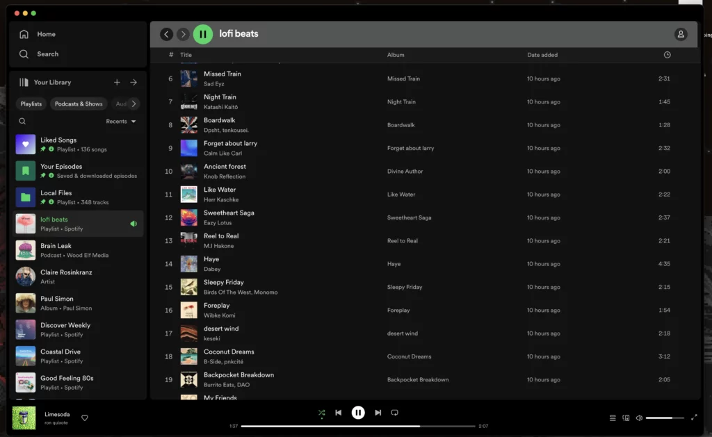
Spotify’s user-friendly design prioritizes simplicity, personalization, and convenience, providing users with a seamless and enjoyable music streaming experience.
Here’s why Spotify’s interface is considered user-friendly:
- Intuitive Navigation: Spotify features a simple and intuitive interface that allows users to easily navigate through the app. The main navigation menu, located at the bottom of the screen, provides quick access to essential sections such as Home, Search, Library, and Your Library.
- Personalized Recommendations: Spotify utilizes sophisticated algorithms to offer personalized music recommendations based on users’ listening history, preferences, and behavior. The “Discover Weekly” playlist and personalized daily mixes provide users with fresh music tailored to their tastes, enhancing the overall listening experience.
- Search Functionality: Spotify’s search functionality is robust, allowing users to quickly find artists, albums, songs, playlists, and podcasts. The search results are displayed in a clear and organized manner, making it easy for users to locate the content they’re looking for.
- Playlist Creation and Organization: Spotify makes it easy for users to create and organize playlists according to their preferences. Users can easily add songs to playlists, reorder tracks, and rename playlists, providing a seamless music curation experience.
- Offline Listening: Spotify allows users to download songs, albums, playlists, and podcasts for offline listening. This feature is especially useful for users who want to listen to music without an internet connection, such as during travel or in areas with limited connectivity.
- Cross-Platform Syncing: Spotify offers seamless synchronization across multiple devices, including smartphones, tablets, computers, smart speakers, and gaming consoles. Users can start listening to music on one device and continue seamlessly on another, without interruption.
- Accessibility Features: Spotify’s interface is designed to be accessible to users with disabilities. It includes features such as voice commands, text-to-speech support, and customizable font sizes and color schemes, ensuring that all users can enjoy the platform regardless of their abilities.
Gmail
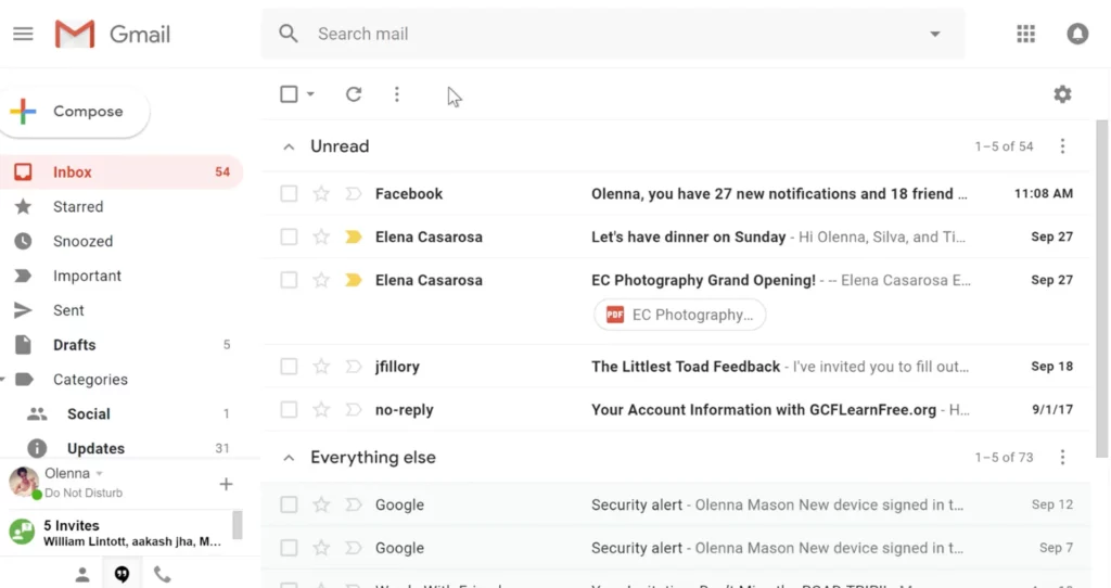
Google’s email service, is renowned for its user-friendly design, which has evolved over the years to prioritize simplicity, efficiency, and organization. Here’s how Gmail achieves its user-friendly interface:
- Clean and Intuitive Layout: Gmail’s interface features a clean and minimalist design, with intuitive navigation elements that make it easy for users to access their emails, compose new messages, and manage their inbox.
- Tabbed Inbox: Gmail’s tabbed inbox automatically categorizes incoming emails into different tabs such as Primary, Social, Promotions, Updates, and Forums. This helps users prioritize and manage their emails more effectively, reducing clutter and improving organization.
- Powerful Search Functionality: Gmail’s search functionality is robust, allowing users to quickly find emails using keywords, sender names, subject lines, and other criteria. Advanced search operators further enhance the search experience, enabling users to narrow down their search results with precision.
- Conversation View: Gmail’s conversation view groups related emails into threaded conversations, making it easier for users to follow the flow of communication. This feature reduces inbox clutter and streamlines the email reading experience, particularly for lengthy email chains.
- Customizable Settings: Gmail offers a wide range of customizable settings and preferences, allowing users to tailor their email experience to suit their needs and preferences. Users can adjust settings related to inbox layout, email forwarding, filters, signatures, and more.
- Integration with Google Services: Gmail seamlessly integrates with other Google services such as Google Drive, Google Calendar, and Google Meet. This integration allows users to access and share files, schedule events, and join video meetings directly from their inbox, enhancing productivity and collaboration.
- Responsive Design: Gmail’s mobile apps for iOS and Android devices feature a responsive design optimized for smaller screens. The mobile apps offer a user-friendly interface that retains key functionalities from the desktop version, allowing users to access their emails on the go.
- Sence of security: Gmail prioritizes user security with built-in features such as spam filtering, phishing protection, two-factor authentication, and confidential mode. These features help safeguard users’ email accounts and sensitive information from unauthorized access and malicious attacks.
Amazon
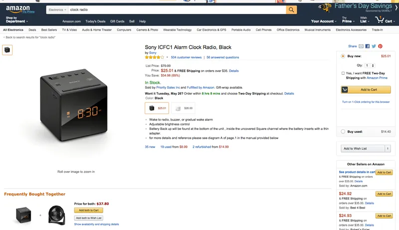
While Amazon’s interface may not be aesthetically pleasing to everyone, its user-friendliness lies in its functional design, intuitive navigation, personalized recommendations, and convenient features that prioritize the needs and preferences of its diverse user base.
- Clear Navigation: Despite its busy appearance, Amazon’s interface is logically organized, with clear navigation menus and search functionalities prominently displayed. Users can easily find what they’re looking for without getting lost in the clutter.
- Comprehensive Search: Amazon’s powerful search engine allows users to quickly locate products by name, category, brand, or even specific features. The autocomplete feature and advanced filtering options help users narrow down their search results efficiently.
- Detailed Product Information: Each product listing on Amazon includes comprehensive details, specifications, images, and customer reviews. This wealth of information empowers users to make informed purchasing decisions without needing to visit multiple sources.
- Personalization: Amazon employs sophisticated algorithms to personalize the user experience. It recommends products based on past purchases, browsing history, and preferences, making it easier for users to discover relevant items.
- Convenient Checkout Process: Amazon streamlines the checkout process by offering various payment options, saved shipping addresses, and one-click purchasing. This reduces friction and enhances the overall user experience.
- Prime Benefits: Amazon Prime membership offers additional perks, such as free two-day shipping, exclusive deals, streaming services, and more. These benefits incentivize users to engage with the platform regularly and contribute to its user-friendly reputation.
- Customer Service: Amazon’s commitment to customer service is a key factor in its user-friendliness. It provides robust customer support channels, including live chat, email, and phone support, as well as a hassle-free returns policy, instilling trust and confidence in users.
TikTok

TikTok, a widely popular social media platform, also boasts a user-friendly interface tailored to mobile devices. Here are some key aspects of TikTok’s user-friendly interface:
- Feed: The main feed of TikTok displays a continuous stream of short video clips, tailored to the user’s interests based on their interactions with the app. This algorithmic feed ensures that users are constantly presented with engaging content without having to search for it manually.
- Discoverability: TikTok’s interface makes it easy for users to discover new content and creators. The “For You” page provides personalized recommendations, while the “Discover” tab allows users to explore trending challenges, hashtags, and categories.
- Video Creation Tools: TikTok offers a wide range of intuitive video creation tools, including filters, effects, soundtracks, and editing features. The interface is designed to be user-friendly, allowing users to quickly record, edit, and share creative videos directly from their smartphones.
- Engagement Features: TikTok encourages user engagement through features like likes, comments, shares, and duets (where users can create split-screen videos with other users). These interaction options are easily accessible within the interface, fostering a sense of community and collaboration among users.
- Accessibility: TikTok’s interface is designed to be accessible and easy to navigate for users of all ages and backgrounds. The layout is clean and intuitive, with prominent buttons and icons guiding users through the app’s various features and functions.
Overall, TikTok’s user-friendly interface plays a significant role in its widespread adoption and popularity among users worldwide, enabling seamless content consumption, creation, and engagement within the platform.
How to make your interface user-friendly
Here’s how to make your interface user-friendly:
- Simplicity: Keep the interface clean and uncluttered, prioritizing essential elements and minimizing distractions.
- Intuitiveness: Design the interface so that users can easily understand how to navigate and interact with it without the need for extensive instructions.
- Organization: Group related elements together logically and provide clear visual cues to help users understand the structure of the interface.
- Personalization: Offer personalized recommendations or customization options to cater to the individual preferences and needs of users.
- Efficiency: Streamline workflows and interactions to allow users to accomplish tasks quickly and with minimal effort.
- Feedback: Provide users with clear feedback on their actions, such as confirmation messages, error notifications, or progress indicators.
- Accessibility: Ensure that the interface is accessible to users of all abilities, with features such as keyboard shortcuts, screen reader compatibility, and adjustable font sizes.
- Consistency: Maintain consistency in design elements, layout, terminology, and interaction patterns throughout the interface to provide a cohesive and familiar experience.
- Integration: Integrate with other relevant services or platforms to provide users with a seamless experience across different tools and devices.
- Security: Implement security features to protect users’ data and privacy, such as encryption, secure authentication methods, and proactive threat detection.
What is another word for user-friendly?
Another word for “user-friendly” is “intuitive” when you open a thesaurus. Both terms can be regarded as synonyms that describe interface designs that are easy for users to understand, navigate, and interact with, often requiring minimal instruction or prior knowledge.
Conversely, an unfriendly user interface may be called unintuitive, confusing, frustrating, or cumbersome. These terms describe interfaces that are difficult to navigate, lack clear organization, provide little feedback, and overall hinder the user’s ability to accomplish tasks efficiently.
Such interfaces may also be described as counterintuitive, unfocused, overwhelming, or inaccessible, as they fail to prioritize user needs and preferences. Ultimately, an unfriendly user interface detracts from the user experience, leading to frustration and dissatisfaction.
Software applications that are overly complex, difficult to navigate, and require specialized knowledge to use effectively can be considered not user-friendly, as they may frustrate users and impede their productivity.
Does user-friendly and ease of use mean the same thing?
While “user-friendly” and “easy to use” are related concepts, they are not exactly the same.
“User-friendly” generally refers to products, interfaces, or systems that are designed with the user’s ease of use and convenience in mind. A user-friendly product or interface is intuitive, efficient, and accessible, allowing users to accomplish tasks or goals with minimal effort and frustration. It encompasses various aspects such as intuitiveness, clarity, efficiency, feedback, accessibility, and flexibility, all aimed at providing a positive and satisfying user experience.
On the other hand, “easy to use” specifically emphasizes the simplicity and straightforwardness of interacting with a product or interface. A product that is easy to use is one where users can quickly understand how to navigate, operate, and accomplish tasks without encountering unnecessary complexity or confusion.
In essence, user-friendliness contributes to ease of use, but it also encompasses additional factors such as accessibility, feedback mechanisms, and flexibility that enhance the overall user experience. Therefore, while user-friendly products are often easy to use, not all easy-to-use products may necessarily be considered fully user-friendly.
Create user-friendly interfaces with UXPin
To craft a user-friendly interface, prioritize simplicity and clarity to prevent overwhelming users. Ensure intuitive navigation, organizing features logically, and offer personalization options for user customization.
Streamline workflows for efficiency and provide clear feedback to enhance user understanding. Design with accessibility in mind and maintain consistency throughout the interface. Seamless integration with relevant services and a focus on security and privacy round out the approach. By following these principles, you can create an interface that fosters user satisfaction and engagement.
Build user-friendly interfaces in UXPin, a prototyping tool that will make your design highly interactive and collaborative. Streamline UI design, design handoff, and keep your design consistent between design and development. Try UXPin for free.
