404 Page Best Practices – Top 5 UX/UI Design Tips
No matter how incredible the design is, 404 pages can frustrate your users. The UX design team’s goal is to provide the fastest solution to fix the error with minimal effort.
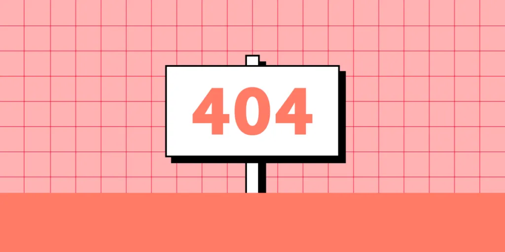
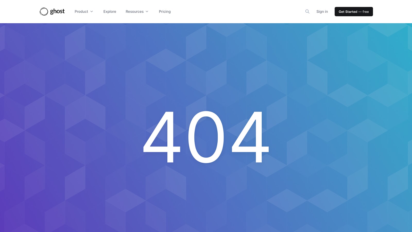
404 pages are an interesting facet of website design. Some designers choose to be creative, while others clearly have better things to do–like this example from the blogging platform Ghost. 404 error page. 5 minutes. Done.
This article reviews 404 pages from some of the world’s leading brands, including tips and best practices.
Design, prototype, and test your web design with the world’s most advanced design tool. Start designing incredible user experiences with UXPin Sign up for a free trial.

What is the Purpose of a 404 Page?
A 404 error occurs when someone types the wrong URL, or the page doesn’t exist. They may have entered the address incorrectly or clicked a “broken link.” A 404 page informs the user of this error.
404 error history
The earliest models of personal computers had 64k RAM or less. Programmers needed to keep things simple. They developed a classification system for program functions. Input errors got assigned to class 400.
There are four class 400 input errors (status codes).
- 400 Bad Request. The input is in the wrong syntax.
- 401 Unauthorized. The user cannot access without a username and password.
- 403 Forbidden. The user doesn’t have permission to access the file.
- 404 Page Not Found. The user entered or linked to a URL that doesn’t exist.
In these early days, the computer gave no solutions, just an error code–not very helpful. Many websites still don’t offer much help or explanation other than the title “404 Page Not Found,” resulting in a poor user experience and missed opportunity.
Why do you need a 404 page?
If you don’t have a dedicated 404 page, the user’s web browser will generate one. This example is what they might see:
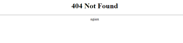
Browser-generated 404 web pages provide a terrible user experience, resulting in lost visitors and potential conversions. The only way to fix it is by editing or retyping the URL–which many people won’t do. This process is particularly frustrating and time-consuming for someone using a mobile device.
A custom 404 page allows designers to take control of the error and provide a smooth user experience to fix it.
How to Design a 404 Page?
A 404 landing page design must be simple and helpful. Here are four key design elements to include.
- Header navigation: allows users to find the content and features they are looking for.
- 404 error title: explicitly describes the error type so users immediately know what has happened.
- Error message: summarize the error in a sentence. Unfortunately, with a 404 error, it’s difficult to determine what went wrong other than the page doesn’t exist.
- Links: the link or links on your 404 error page will depend on your website and content. For example, Google’s 404 error page provides one link to the homepage via the company’s logo.
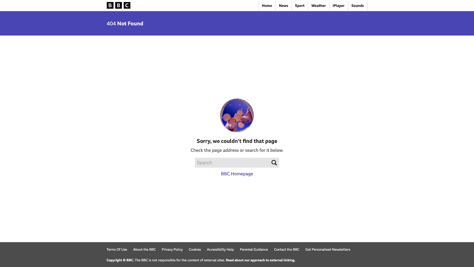
The news publisher BBC provides several options:
- A purpose-built header navigation with popular content categories
- A link to the homepage
- Search box
Custom 404 Page Best Practices
Error prevention
The first step must be 404 error prevention. While it’s near impossible to control human error–i.e., entering the wrong address–there are steps webmasters can take to prevent 404s from occurring.
While some of these tasks are beyond a designer’s responsibility, as advocates for user experience, designers must ensure the relevant team monitors and addresses these issues.
- Broken internal links are links from one page to another on your website, which are easy to fix and prevent 404 errors. Regular UX audits will ensure these broken links are identified and fixed.
- It’s essential to use 301 redirects when deleting pages or changing URL structure. These redirects provide a good user experience and help with SEO.
- Use tools like Ahrefs, Ubersuggest, and SEMRush to find broken backlinks and contact the publishers to correct the mistake—usually an SEO manager’s responsibility.
Implementing these error-prevention processes will reduce the likelihood of 404 errors, creating a better user experience for your website visitors.
Keep it simple – “Don’t make me think”
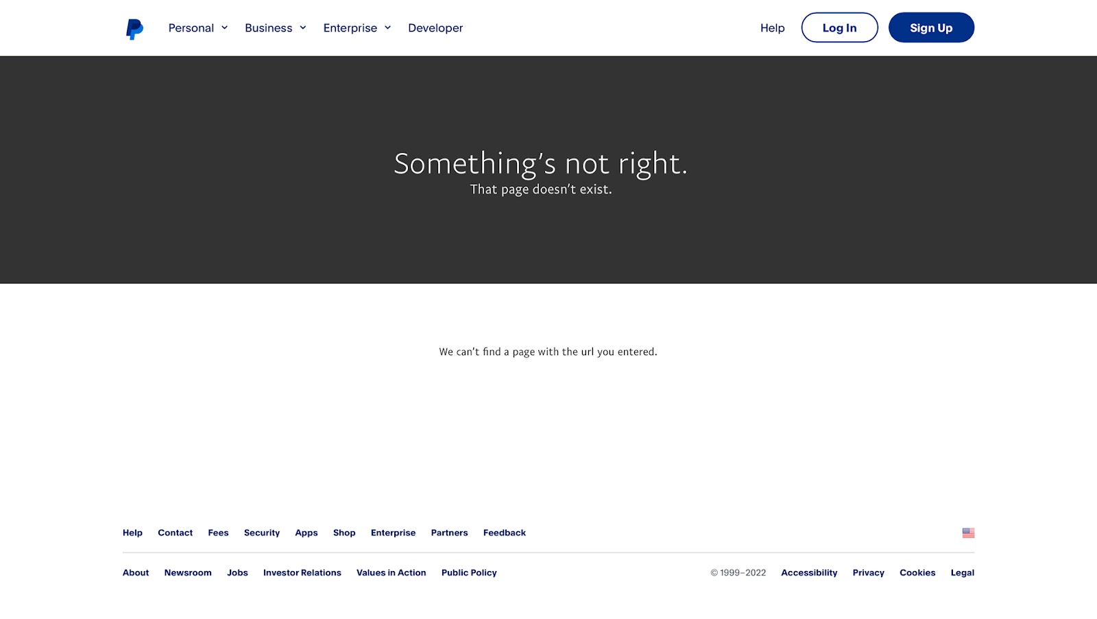
404 pages are annoying and frustrating, especially if it’s content you need urgently. Designers must avoid clutter by providing users with the fastest solution to move on. Here are two excellent examples from PayPal and YouTube.
Global payment giant PayPal have a simple 404 page that’s easy to read and understand with minimal thinking. The header and footer navigation are visible above the fold, meaning users can find the appropriate links without scrolling.
YouTube takes design simplicity to the next level on its 404 page with a monkey graphic, short explanation, logo (linked to the homepage), and search field.
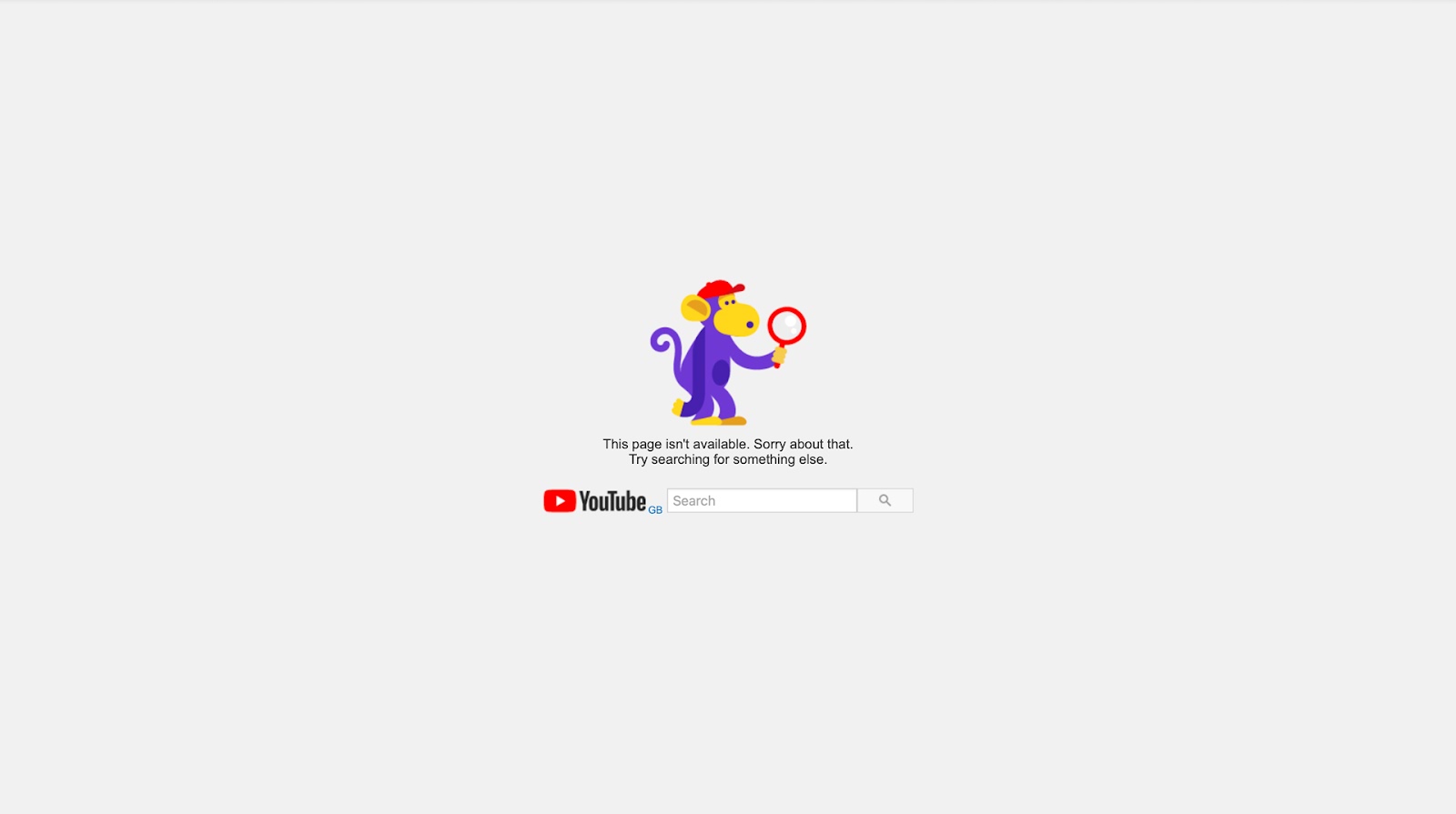
With both examples, users don’t have to read and process what has happened; they can simply move on.
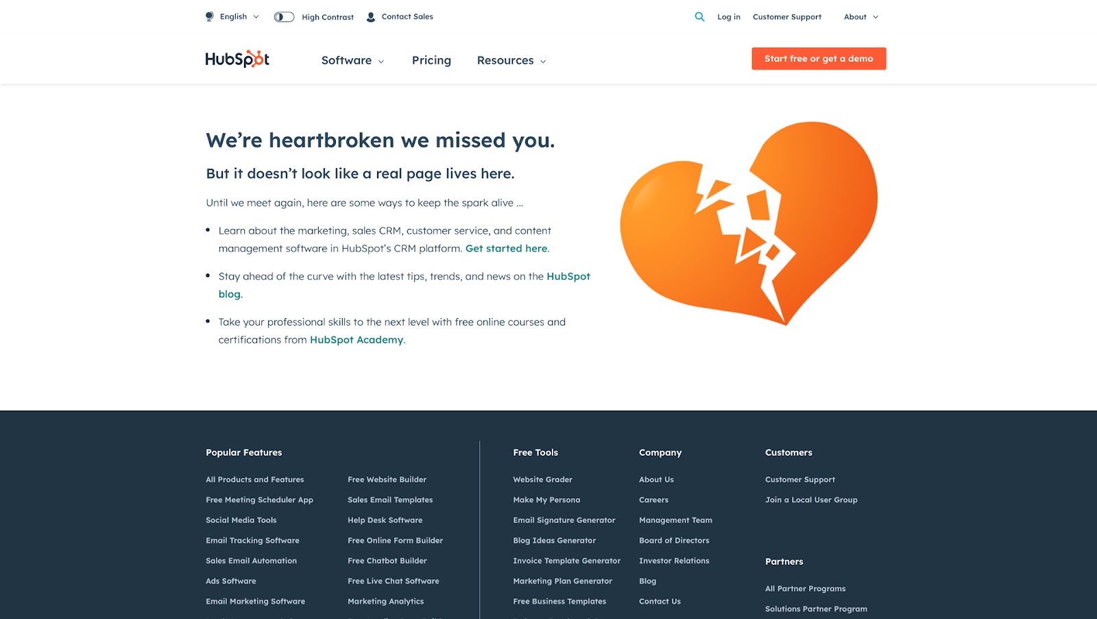
The opposite of this example is HubSpot. While we love HubSpot’s products, their 404 page is very busy and confusing. There’s no reference to a 404 or error; you must read the first few lines of text before realizing what’s happening.
Maintain brand consistency
404 pages must maintain brand and design consistency so that users know they’ve arrived at the correct website. Providing a smooth user experience to solve the issue will help strengthen brand affinity.
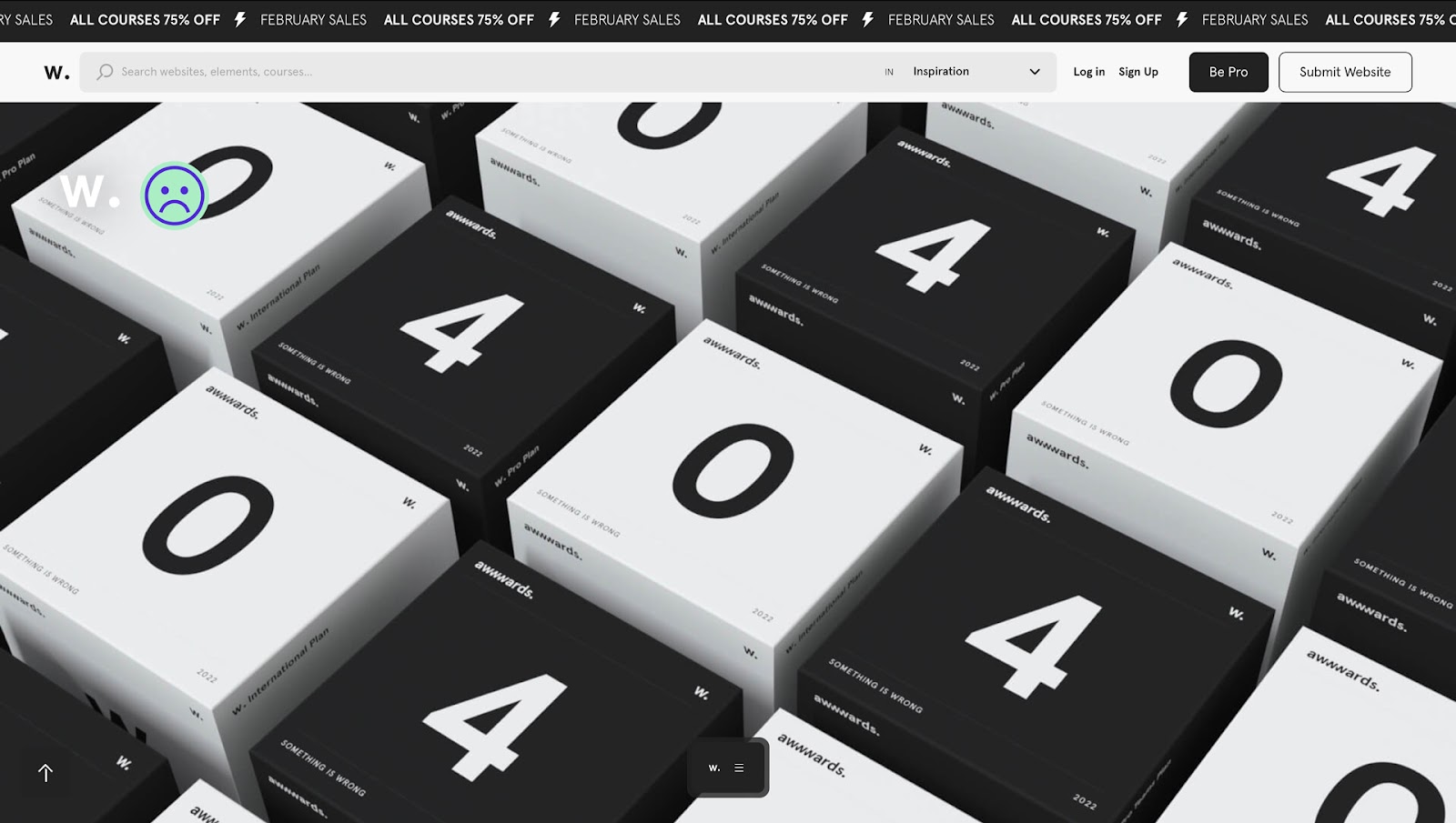
One of the best 404-page examples we’ve found is from the awwwards website. Awwwards’ designers have created a beautiful 3D-style 404 page that looks fantastic and fits the brand–showcasing the best web design.
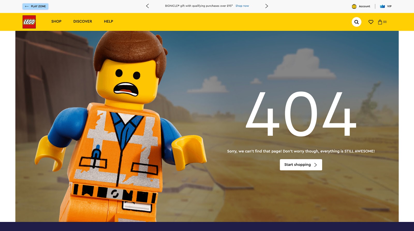
Lego’s 404 page is another example where designers have nailed the on-brand experience with humor and business value. The Lego Movie character Emmet, the construction worker, appears concerned, while the call-to-action (CTA) is “Start shopping”–an excellent strategy for eCommerce 404 pages.
Use humor–with caution
The problem with using humor is that it’s subjective. What one person finds funny, another will find annoying for a 404 page. If you’re going to use humor, make sure it doesn’t require too much reading to interpret, or you’ll make a frustrating experience worse, particularly for users with cognitive and learning disabilities.
Our UXPin 404 page features a fun design and caption, but it’s still very clearly a 404 error, and we provide a bright blue button taking users to safety.
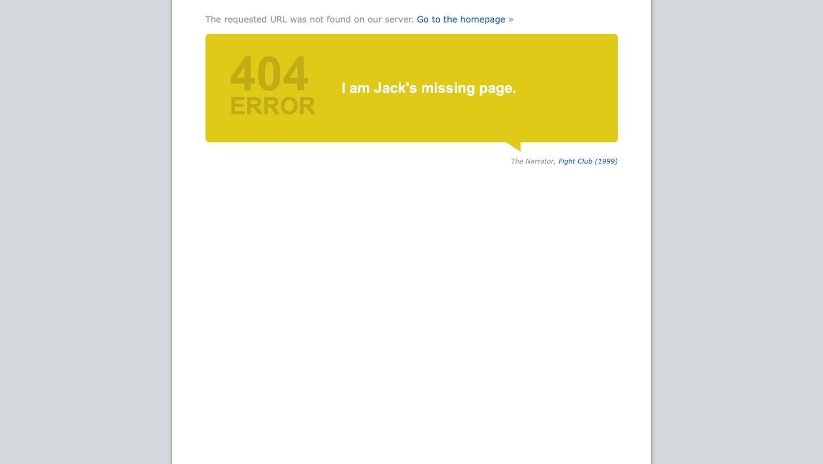
IMDB’s 404 is another excellent example of on-brand humor. The page features a large speech bubble with a 404 ERROR in bold and a movie quote, replacing the keyword with “page.”
In this example, it’s “I am Jack’s missing page”–a quote from the 1999 blockbuster phenomenon Fight Club. This quote changes each time, providing users with a link to the movie.
Business opportunities and increasing conversions
Designers can utilize 404 pages to promote products or steer users to revenue-generating opportunities. Like humor, it’s important to approach this design strategy with caution–it must be clear this is a 404 page and that you’re not trying to take advantage of a bad situation.
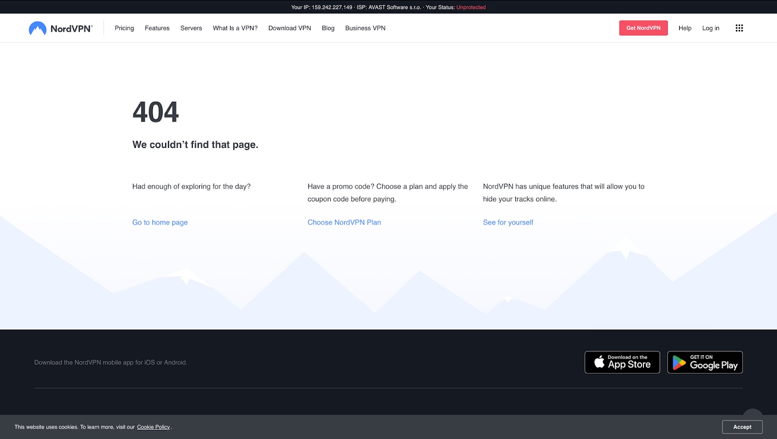
VPN provider NordVPN provides links to its VPN plans and features. This strategy works well for NordVPN because they only sell one product on this website, so most visitors want to view either of these pages.
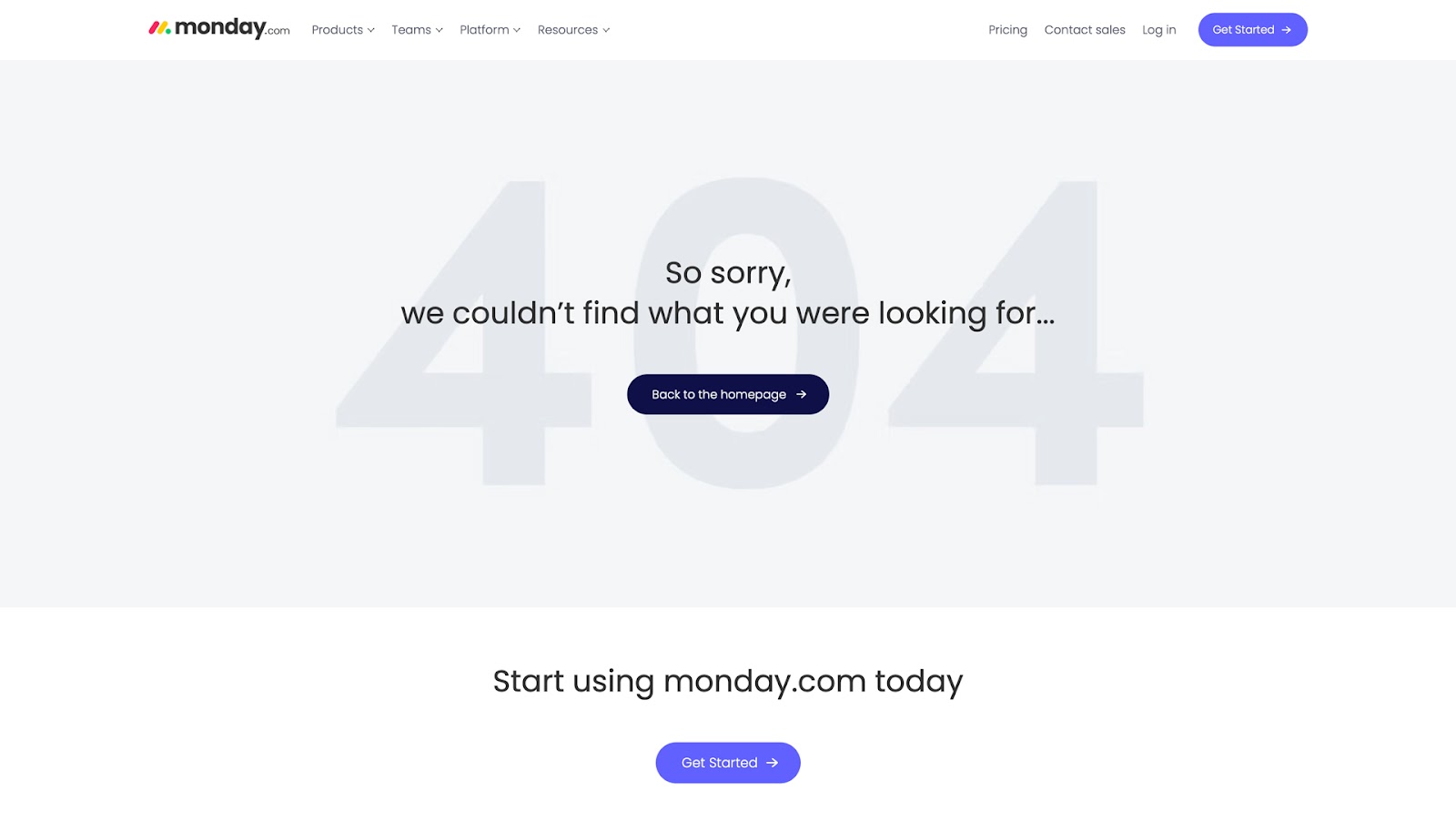
Productivity app Monday.com uses a minimal 404-page design. The primary CTA in the center of the screen helps users by directing them to the homepage, while a second CTA lower on the screen encourages visitors to try the product.
Website Design With UXPin
Designing websites and error pages with most image-based design tools is relatively simple, but getting accurate results during testing is nearly impossible. Designers must rely on external tools or get engineers to build code-base prototypes.
UXPin is a code-based design tool that allows designers to achieve the same results with prototypes as front-end devs do with code. The best part. Designers use UXPin exactly as they would with any popular image-based tool and don’t have to write a single line of code.
Interactive prototyping
UXPin’s interactive prototypes respond to user triggers like clicks, taps, swipes, scrolls, etc., providing users with a prototype experience that’s indistinguishable from the final product.
UXPin also connects to APIs via IFTTT, allowing teams to import live data, send emails, sync calendars, send a Tweet, or link to IoT devices from a prototype built using a design tool.
These interactive prototypes allow designers to increase prototyping scope, thus solving more issues while identifying more business opportunities.
Advanced code-based features
UXPin has four key features that set it apart from other popular design tools. These features allow designers to create complex user interfaces and components that look and feel like the final product.
- States: allow designers to create multiple states for a single UI element and design complex interactive components like accordions, carousels, steppers, and more.
- Variables: capture data from user inputs and create personalized, dynamic user experiences–like a welcome message using data from the name field in a signup form.
- Expressions: Javascript-like functions to create complex components and advanced functionality–no code required!
- Conditional Interactions: create if-then and if-else conditions based on user interactions to create dynamic prototypes with multiple outcomes to accurately replicate the final product experience.
With UXPin’s advanced prototypes, designers can test form error handling, error pages, and other usability issues during the design process, ensuring users have the correct information to fix problems fast.
Start designing better websites and digital products with the only design tool built for accurate user experience prototyping and testing. Explore UXPin’s advanced features. Sign up for a free trial.


